Who Greenlit This? 40 Design Fails That Hurt to Look At
Somewhere out there, a designer thought, “Yes. This is perfect.” And someone else—equally confident—nodded and signed off on it. The result? Pure, unfiltered chaos.
Welcome to the strange and spectacular world of design fails—where stairs go nowhere, signs contradict themselves, and toilets defy physics. Life already feels like a puzzle sometimes, but these creations make you wonder if someone threw away the instruction manual entirely.
At Grumpy Sharks, we’ve scoured the digital depths of Reddit’s infamous r/CrappyDesign to bring you 40 jaw-dropping examples that will have you squinting, sighing, and maybe even laughing through the pain. From bizarre bathroom placements to fonts that actively fight your eyes, these masterpieces of misjudgment are a reminder that not all ideas deserve to see the light of day—or at least not without a second opinion.
So brace yourself. You’re about to embark on a tour of the world’s worst design choices. Whether you’re a perfectionist who breaks out in hives at misaligned labels, or just someone who appreciates a good dose of unintentional comedy, this roundup is here to both entertain and mildly traumatize.
#1 A powerbank with a built-in compass. The compass doesn’t work because the battery it’s attached to disrupts the magnetic field around it.

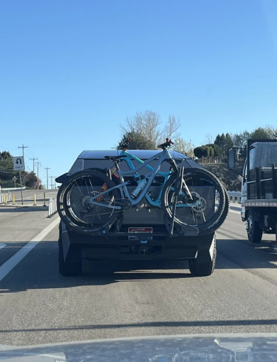
#2 Cyber truck bike rack blocks the license plate and brake lights
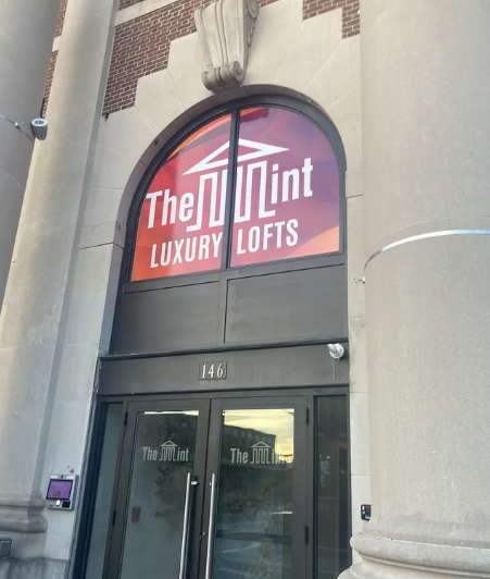
#3 It’s apparently supposed to say The Mint
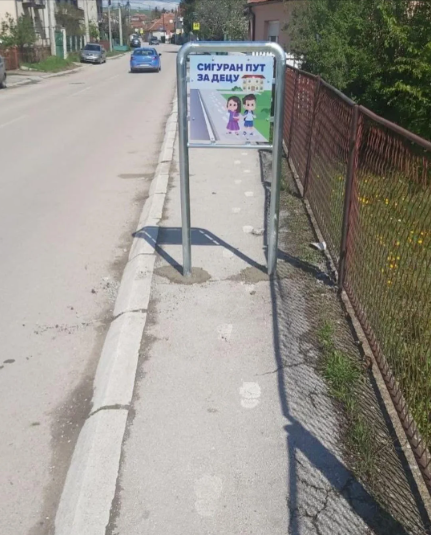
#4 “Safe road for children”
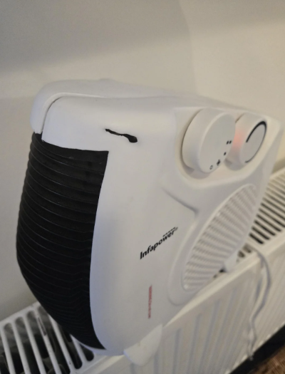
#5 This heater that’s melting itself
Every single one of these glorious disasters hails from the subreddit r/CrappyDesign, a 3-million-strong community devoted to showcasing what happens when logic takes a back seat. With thousands of active users posting, voting, and commenting daily, this corner of Reddit has become a virtual museum of design mishaps—from hilariously confusing UI to architecture that screams, “I give up.”
You’ll find posts like “stairway to nowhere,” toilet stalls with transparent doors, and warning signs that seem more threatening than helpful. What makes this subreddit special isn’t just the fails—it’s the collective gasp, cringe, and giggle that unites everyone who sees them. The top-voted posts usually include absurd but real products that somehow made it through meetings, approvals, and production.
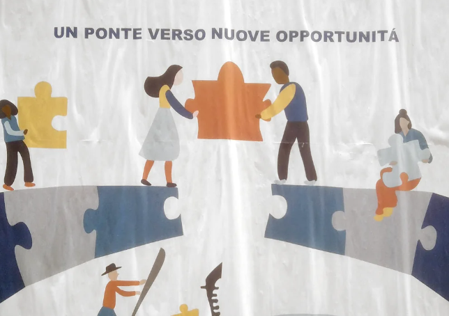
#6 The puzzle tile is too small to complete the bridge
#7 We called this the VRBO death toilet
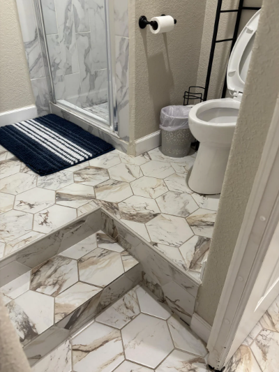
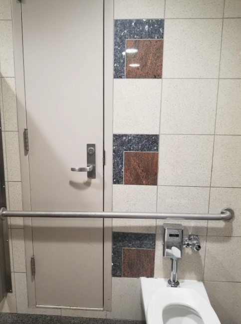
#8 We called this the VRBO death toilet
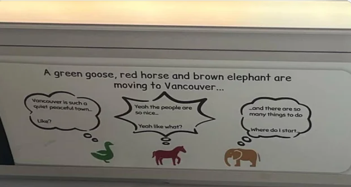
#9 This Vancouver ad. The headline sounds like a start to a punchline that doesn’t exist, and the speech bubbles make no sense if you read them intuitively.
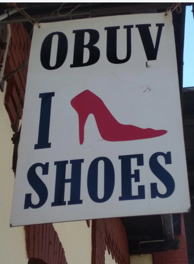
#10 I Shoe Shoes
You ever walk into a room and immediately question reality? That’s the power of bad design. It doesn’t gently whisper; it yells. We’ve all experienced it—buttons that don’t tell you what they do, instructions that make you feel like you failed a basic IQ test, or chairs that punish you for trusting them.
These images capture that exact feeling. That brief pause when your brain stalls, wondering how we got here as a species. That faucet pointing at the counter instead of the sink? That elevator with no button for the floor you’re on? Yeah, we saw it too. Design is supposed to make life easier. These just… don’t.
But maybe that’s why we love them. They make us feel like we’re not alone in our daily “What the heck?” moments. They remind us that even professionals have off days. And hey, at least we can all laugh about it together. These aren’t just mistakes. They’re oddly comforting proof that perfection is overrated.
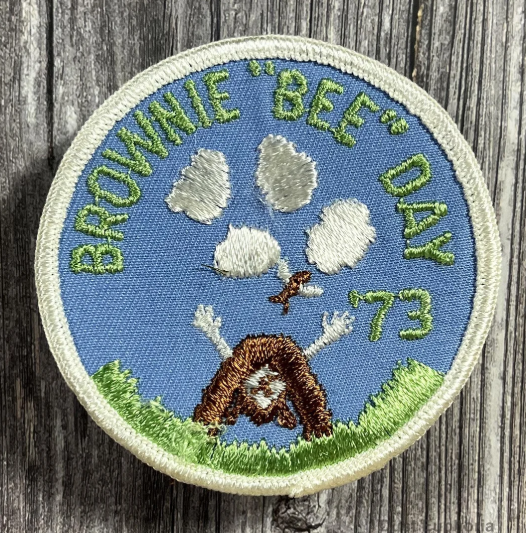
#11 Girl Scout Brownie “Bee” Day patch from 1973
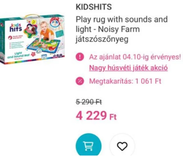
#12 Unfortunate brand name
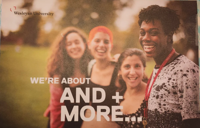
#13 What is this supposed to say??
#14 Brownies so good, they consume you

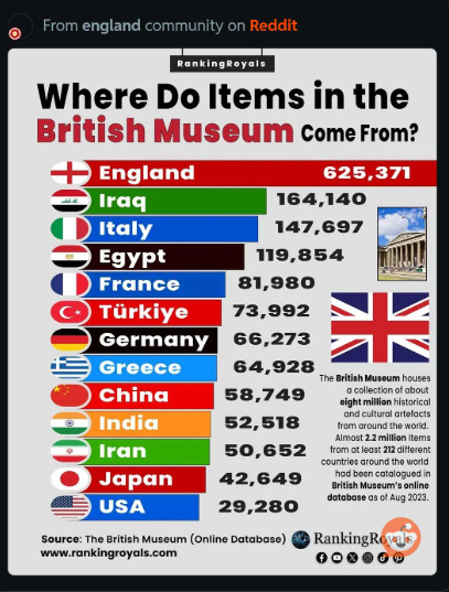
#15 Terrible graph, not to scale
I remember checking into a hotel in the middle of nowhere. Exhausted, half asleep, I tried to turn on the light. What greeted me was a light switch—located above the bed—but directly behind the headboard. I had to stand on the mattress, twist my arm backward like a human pretzel, and feel around for a switch like I was trying to defuse a bomb. Who approved that?
That night, I laughed out loud alone in the dark. Because if you don’t laugh, you cry. It’s not the worst thing in the world, but it sure felt like a design war crime. And somewhere, someone got paid to do that.
These stories stick with us because they’re so absurd, so pointlessly frustrating, and yet so very human. And isn’t that what makes them great?
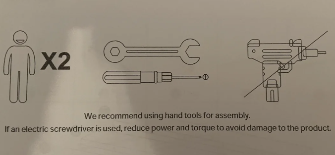
#16 “Of course I know what a power drill looks like, why do you ask?”
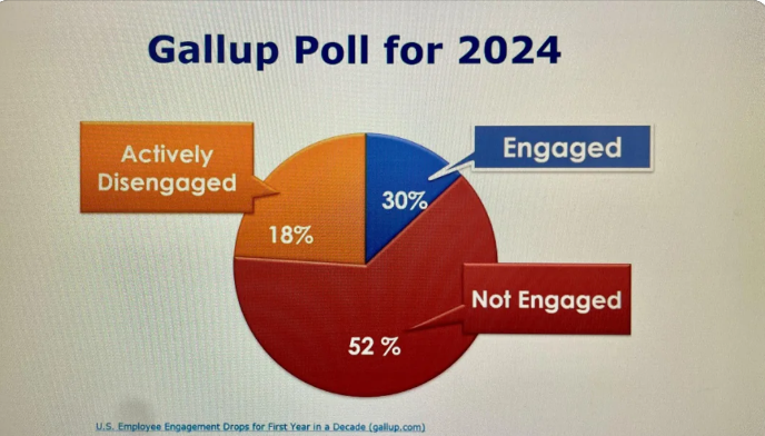
#17 A Pie Chart Used in a Workplace Training
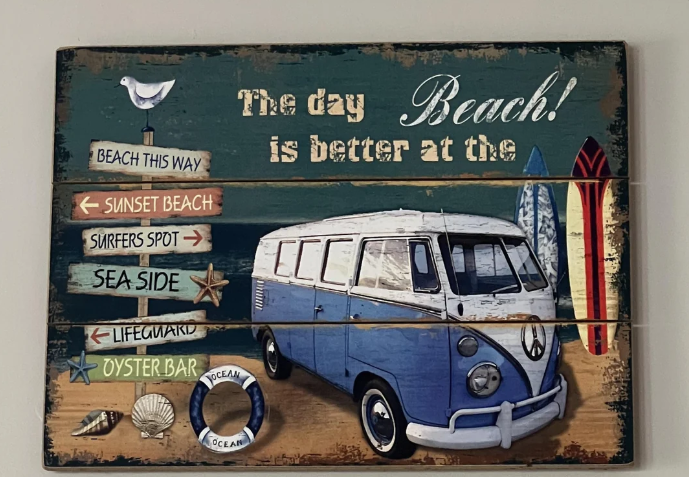
#18 The day BEACH! is better at the
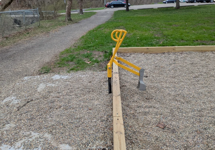
#19 Wheelchair accessible playground digger that has become inaccessible due to all the rocks being dumped out. The scoop isn’t low enough to reach the ones outside the pen.
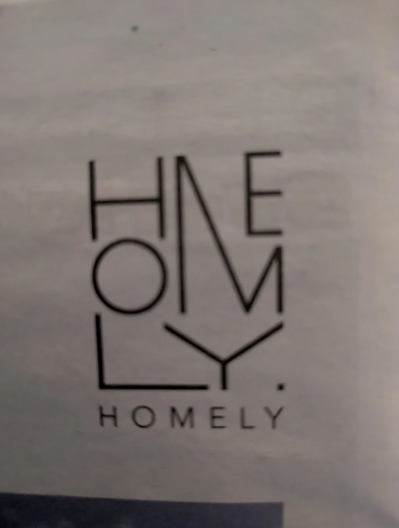
#20 Logo so hard to read they had to add a subtitle saying it normally
Here’s a wild stat: according to a report from the Design Management Institute, companies that prioritize design outperform their peers by over 200%. That’s the power of good design. Now flip that. Bad design doesn’t just confuse—it costs money, time, and trust.
In cognitive psychology, there’s something called the “affordance theory.” It basically means that people understand how to use things based on how they look. A button should look pressable. A door handle should say “pull” without words. When design ignores these cues, our brains short-circuit.
The images in this post are hilarious, yes, but they also show what happens when we ignore how people think and behave. Fonts that blur at a glance. Arrows pointing nowhere. Packaging that makes you pour soup from the bottom. Every failure is a lesson in what not to do—and also a great excuse for some laughter therapy.
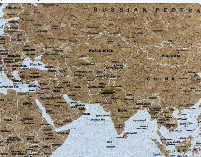
#21 My map is missing the Caspian Sea.
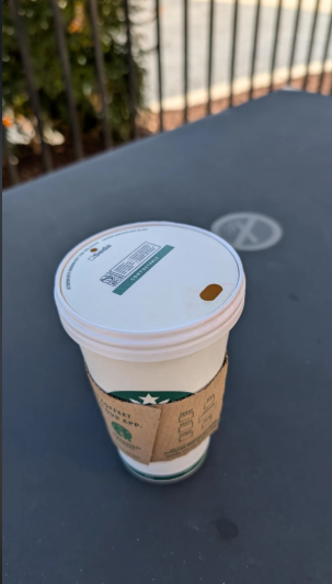
#22 New lids at Starbucks. The barista said “they’re not easy to drink out of. “
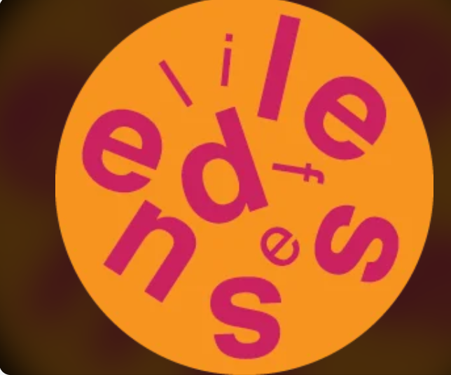
#23 Brewery near me that recently closed. Good luck telling your friends the name of it
#24 That water drop though
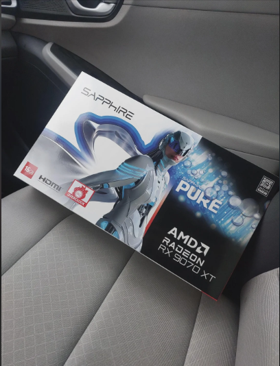
#25 Box for card game says “No Plastic” when the contents are clearly wrapped in plastic

Bad design doesn’t just mess with your day. It taps into something deeper—our craving for logic, order, and simplicity. When something breaks that expectation, it can feel jarring. Annoying. Even offensive.
In child development psychology, predictability and clarity are foundational. That doesn’t go away as adults. We still want things to make sense. That’s why walking into a bathroom where the toilet is placed behind the door hits differently. It feels personal.
We all seek control in small ways. And when even a sign can’t tell us which way is up? That chaos lodges in our brain like an itch. These designs make us laugh now, but in the moment? They spark real frustration. And that makes them unforgettable.
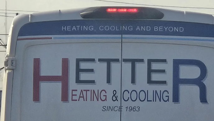
#26 You can have both the H and the R, or you can have neither
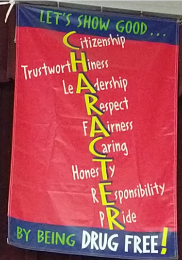
#27 The designer used trustwortHiness as the H word, honesTy as the T, and then some others.
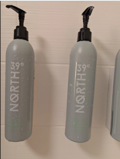
#28 I guess you have to sniff these to tell the shampoo from the conditioner.
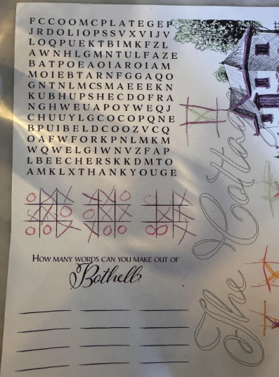
#29 Kids word search unevenly spaced; how can they find vertical and diagonal words?!
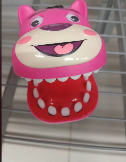
#30 A dog toy that has 2 mouths
Look around your city. Chances are, there are signs pointing the wrong way, benches with spikes, or walkways that lead to walls. These aren’t just internet fails. They’re part of everyday life. And they raise bigger questions about how design affects public trust, accessibility, and even safety.
The rise of user-centered design shows how much we’ve learned from these failures. More brands are hiring designers who test with real users, use inclusive language, and think through unintended consequences. But still, some decisions slip through—whether from budget cuts, oversight, or someone just not caring enough.
We laugh because it’s absurd. But there’s something telling in how much attention bad design gets. It means people notice. They care. And maybe, slowly, that awareness helps raise the standard.
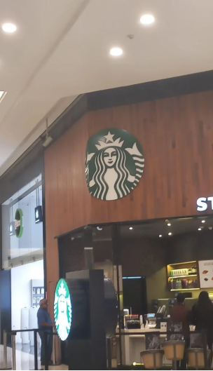
#31 Honestly i can’t find any good reason to put 10% of a logo on a corner, its just weird as hell
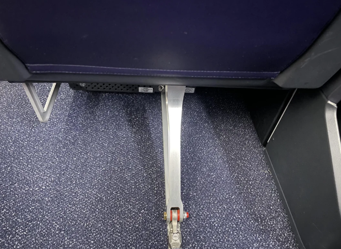
#32 Delta Airlines “First Class” under-seat storage.
#33 Meaning less Advertisement

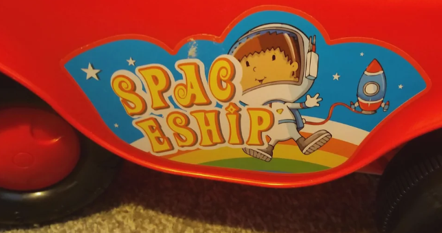
#34 Spac eship (on a toy truck)
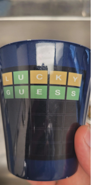
#35 This isn’t how wordle works.
Grumpy Sharks spoke with Don Norman, author of The Design of Everyday Things and former VP at Apple. He’s spent decades studying how and why people interact with design.
“The biggest problem with bad design is that it blames the user,” he told us in an interview with the BBC. “You push a door and it doesn’t open—so you feel dumb. But it’s not you. It’s the door. A good design explains itself.”
Norman argues that truly bad design isn’t about aesthetics—it’s about failure to communicate. These 40 images are more than comedy gold. They’re case studies in how not to treat the user.
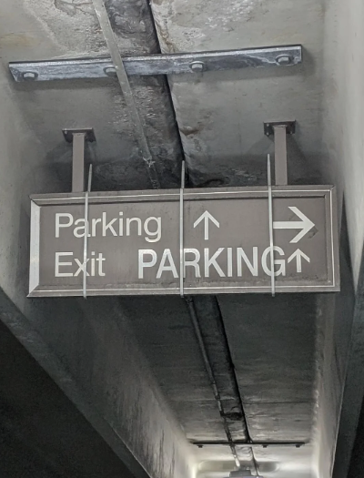
#36 Rumor has it I’ve been looking for the exit to this very day.
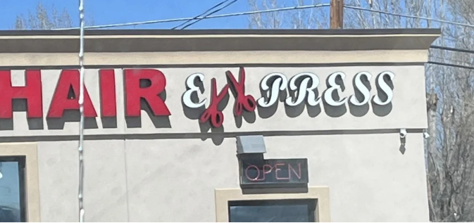
#37 Hair Ex Xpress?
#38 Menu at a restaurant…for cannibals?
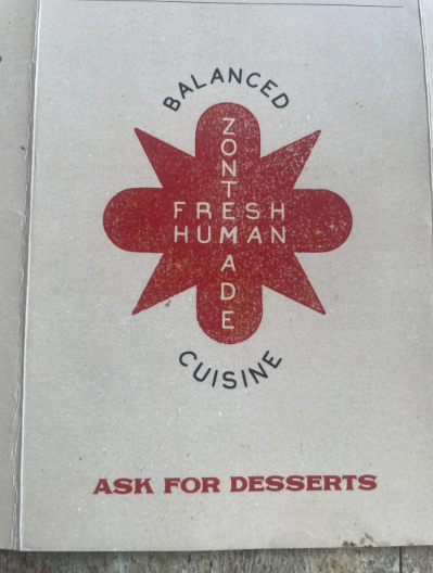
So what should you do the next time you encounter a public bathroom with two sinks and one faucet? Or a cereal box that opens from the bottom?
Take a breath. Laugh. Then maybe snap a photo and share it—because someone else has probably experienced the same absurdity. The world is imperfect. But in that imperfection, we find connection, comedy, and sometimes even inspiration.
And if you’re a designer? Let this be your friendly nudge. Double-check your work. Ask someone who’s not you if it makes sense. The world will thank you. Or at least stop posting your work on Reddit.
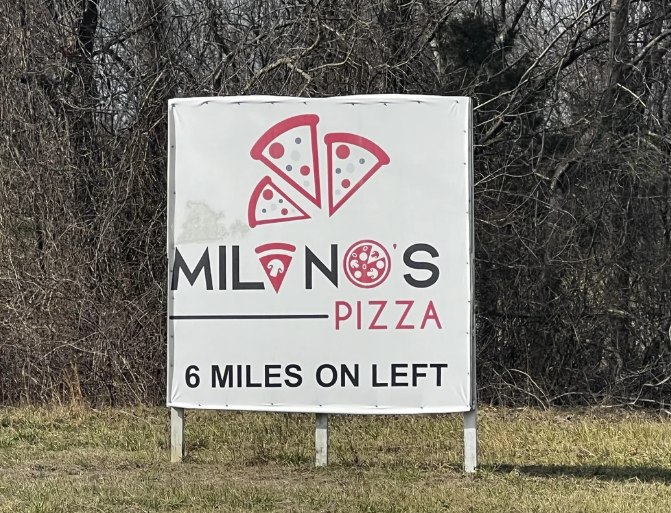
#39 If only you could make a slice of pizza could look like an A.
#40 My ovens terrible temperature dial with odd and inconsistent intervals between temperature, and who knows after 200 (reuploaded for not giving enough detail)
Source: InquisitorCorinthius
And there you have it—40 design disasters that left us scratching our heads and clutching our sides in laughter. From baffling bathroom layouts to signage that defies all logic, these creations prove that not all ideas should make it past the brainstorming phase… let alone into real life. Somewhere, a designer proudly hit “send,” a manager said “looks good to me,” and the world was never the same.
But hey, while these fails may not win any awards, they’ve certainly earned a special place in our hearts (and meme folders). If nothing else, they’re a comforting reminder that perfection is overrated and sometimes, a good laugh is the best kind of design.
Seen any terrible design choices out in the wild? Let them inspire you—or at least warn you what not to do. And remember: the next time you’re faced with a confusing sign or a staircase to nowhere, just smile and think, “Who greenlit this?” Then take a picture… because the internet deserves to see it too.


