Who Greenlit This? 40 Design Fails That Hurt to Look At
Ever seen a design so baffling, so hilariously bad, that you can’t help but wonder, “Who looked at this and said, ‘Yes, perfect!’?” Welcome to the wonderfully absurd world of design fails—where logic is optional, symmetry is a suggestion, and someone, somewhere, definitely got paid for this. “Who Greenlit This? 40 Design Fails That Hurt to Look At” is your front-row seat to a parade of questionable choices and accidental comedy, all in the name of “design.”
These aren’t your average oopsies. We’re talking about stairs that lead to nowhere, signs that contradict themselves, and layouts that seem like they were created during a power outage… by a raccoon. Some of these disasters are the result of poor planning, others from total disregard for usability—and some might just be pranks that went too far. Either way, they’re here to make you cringe, laugh, and appreciate every functional doorknob you’ve ever encountered.
So buckle up, prepare your eyeballs, and remember: the next time you’re having a bad day, at least you didn’t design the bathroom with three toilets and zero privacy. Let’s dive into the bizarre universe where design dreams go to die—and hilarity is born.
#1 A powerbank with a built-in compass. The compass doesn’t work because the battery it’s attached to disrupts the magnetic field around it.

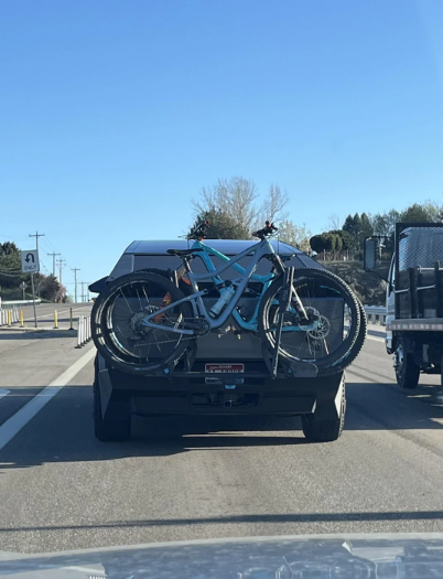
#2 Cyber truck bike rack blocks the license plate and brake lights
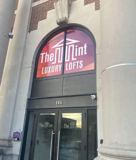
#3 It’s apparently supposed to say The Mint
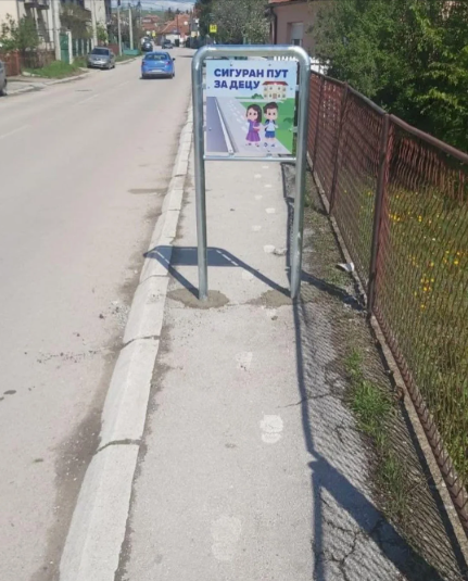
#4 “Safe road for children”
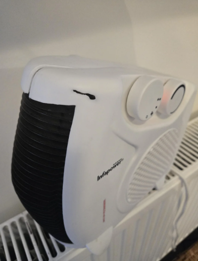
#5 This heater that’s melting itself
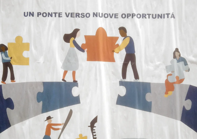
#6 The puzzle tile is too small to complete the bridge
#7 We called this the VRBO death toilet
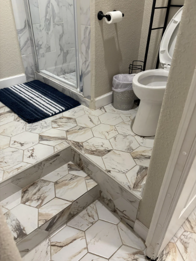
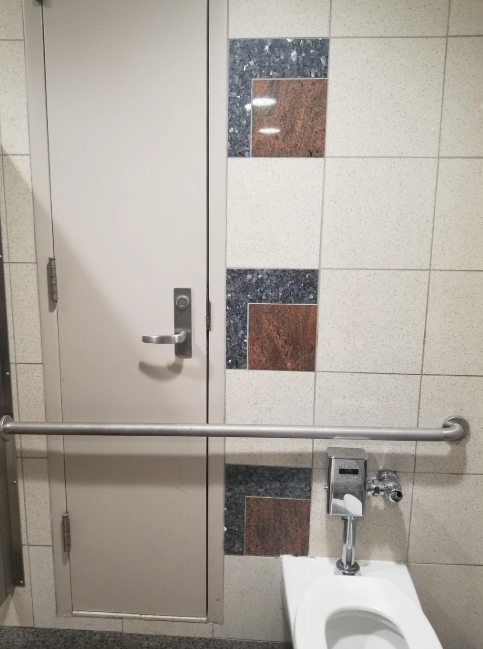
#8 We called this the VRBO death toilet
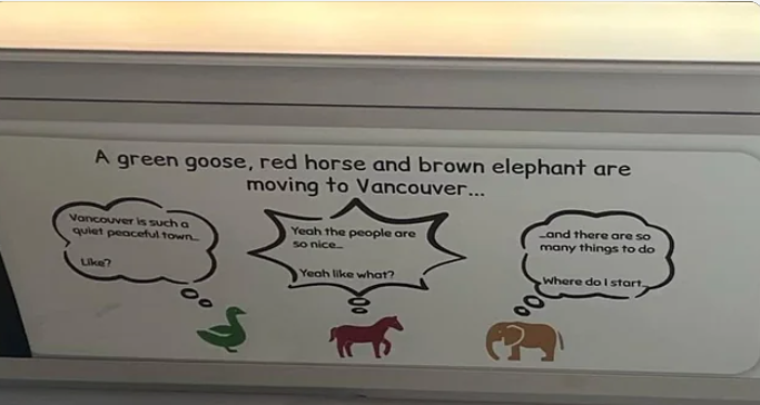
#9 This Vancouver ad. The headline sounds like a start to a punchline that doesn’t exist, and the speech bubbles make no sense if you read them intuitively.
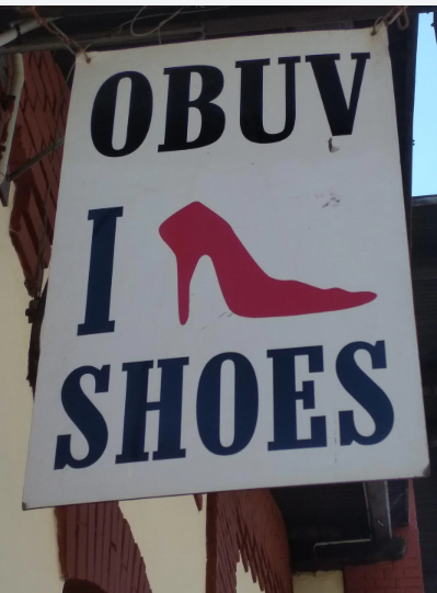
#10 I Shoe Shoes
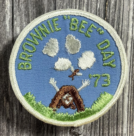
#11 Girl Scout Brownie “Bee” Day patch from 1973
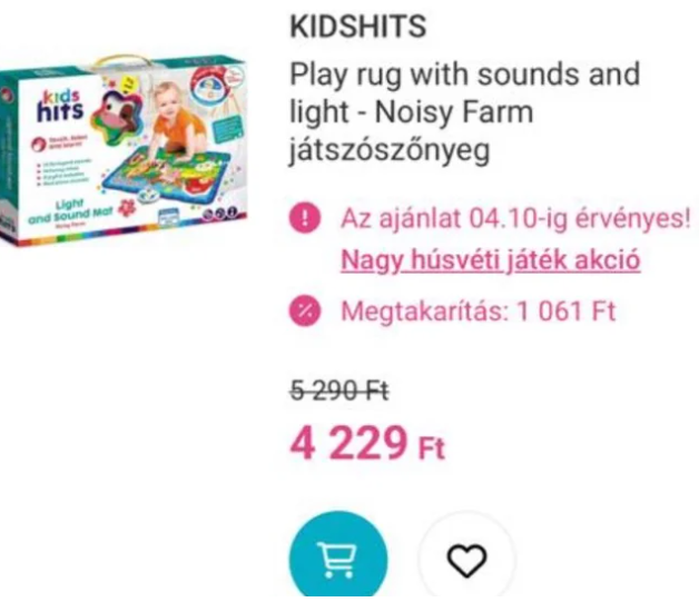
#12 Unfortunate brand name
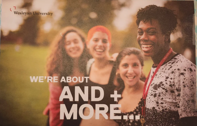
#13 What is this supposed to say??
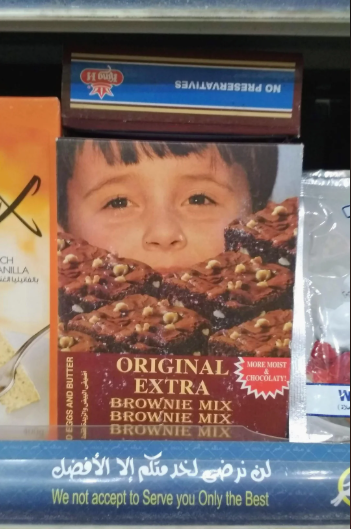
#14 Brownies so good, they consume you
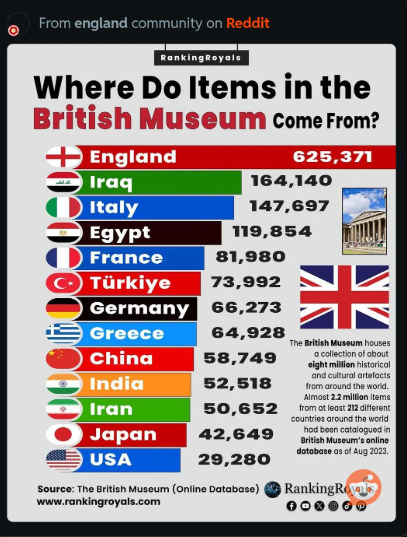
#15 Terrible graph, not to scale
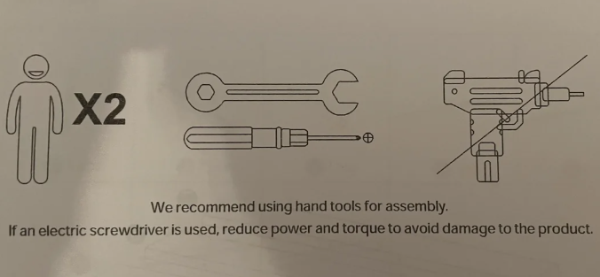
#16 “Of course I know what a power drill looks like, why do you ask?”
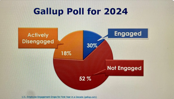
#17 A Pie Chart Used in a Workplace Training
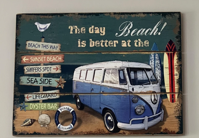
#18 The day BEACH! is better at the
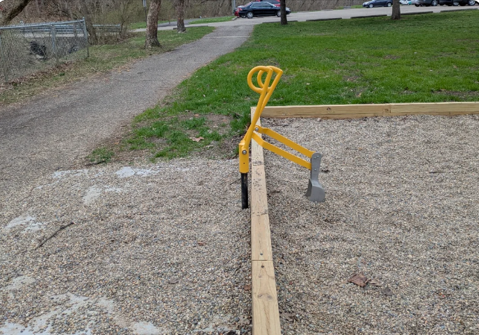
#19 Wheelchair accessible playground digger that has become inaccessible due to all the rocks being dumped out. The scoop isn’t low enough to reach the ones outside the pen.
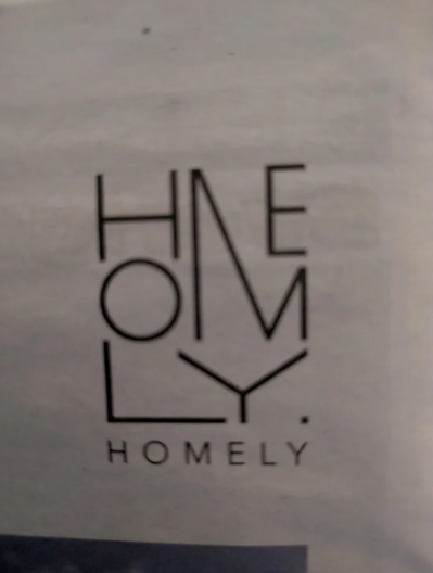
#20 Logo so hard to read they had to add a subtitle saying it normally
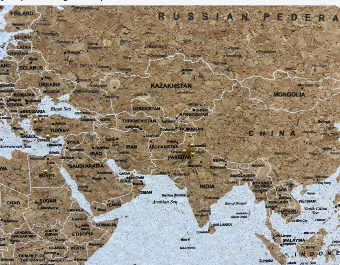
#21 My map is missing the Caspian Sea.
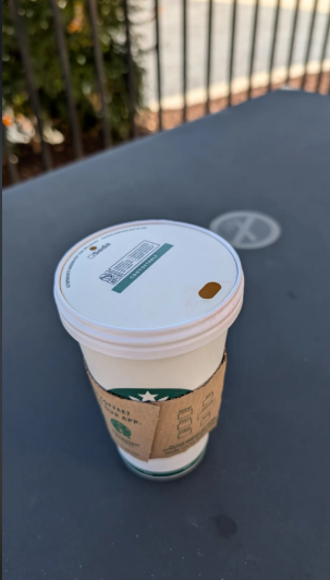
#22 New lids at Starbucks. The barista said “they’re not easy to drink out of. “
#23 Brewery near me that recently closed. Good luck telling your friends the name of it
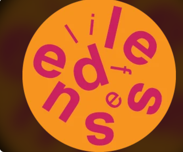
#24 That water drop though
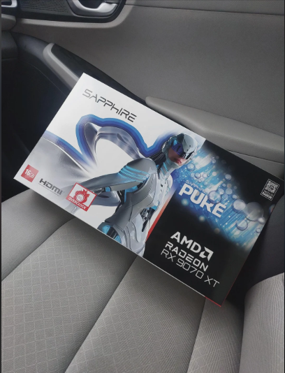
#25 Box for card game says “No Plastic” when the contents are clearly wrapped in plastic

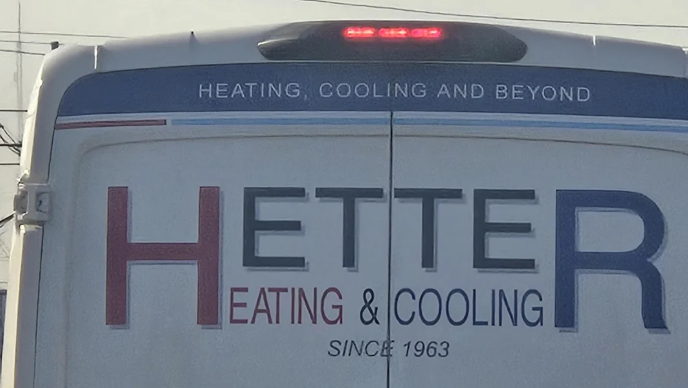
#26 You can have both the H and the R, or you can have neither
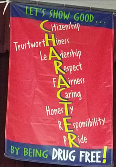
#27 The designer used trustwortHiness as the H word, honesTy as the T, and then some others.
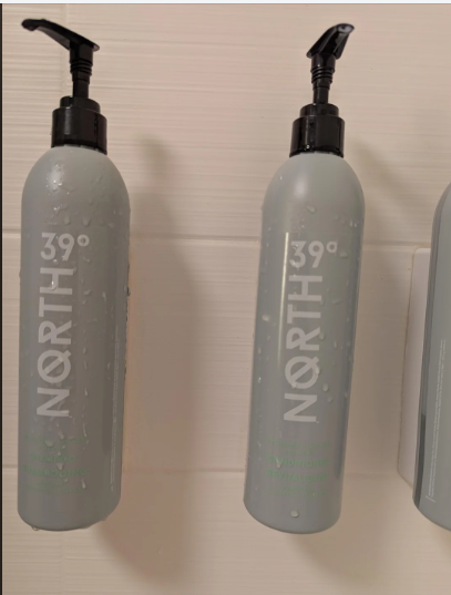
#28 I guess you have to sniff these to tell the shampoo from the conditioner.
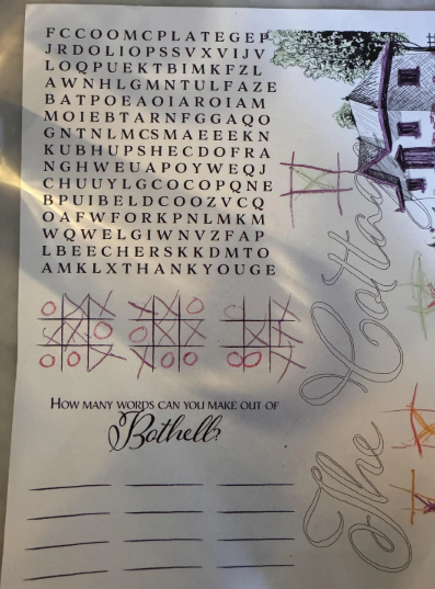
#29 Kids word search unevenly spaced; how can they find vertical and diagonal words?!
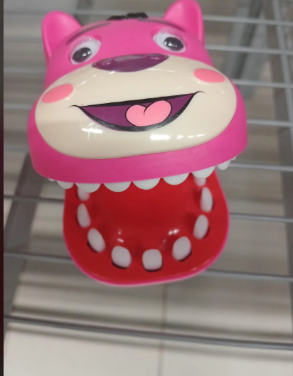
#30 A dog toy that has 2 mouths
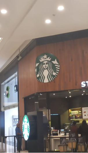
#31 Honestly i can’t find any good reason to put 10% of a logo on a corner, its just weird as hell
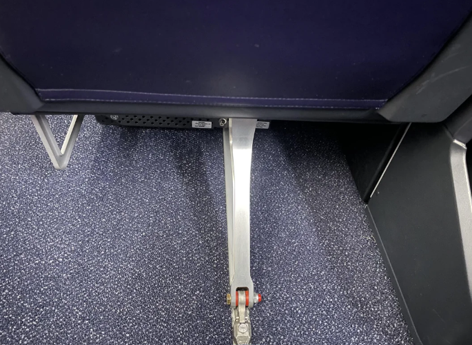
#32 Delta Airlines “First Class” under-seat storage.
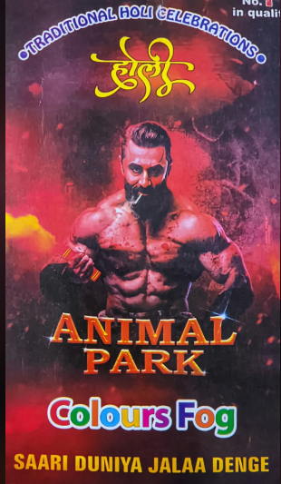
#33 Meaning less Advertisement
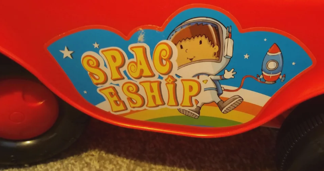
#34 Spac eship (on a toy truck)
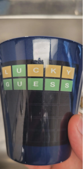
#35 This isn’t how wordle works.
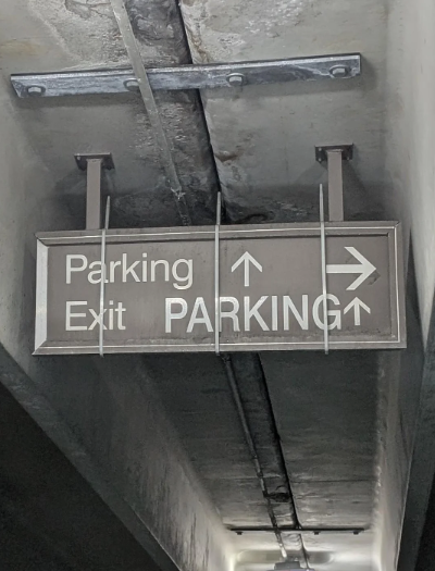
#36 Rumor has it I’ve been looking for the exit to this very day.
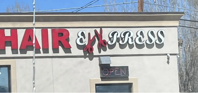
#37 Hair Ex Xpress?
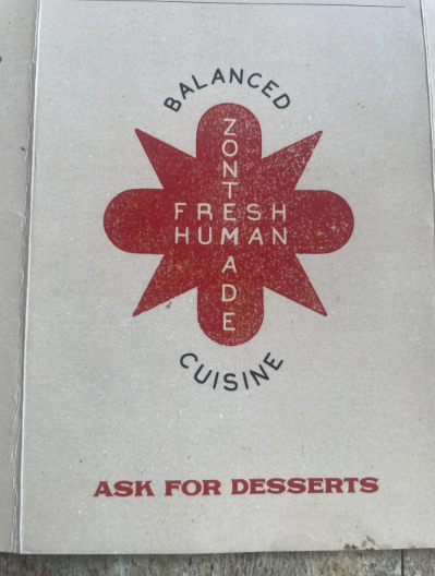
#38 Menu at a restaurant…for cannibals?
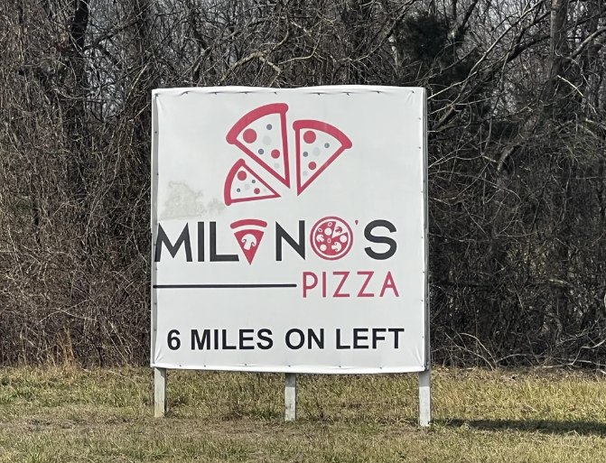
#39 If only you could make a slice of pizza could look like an A.
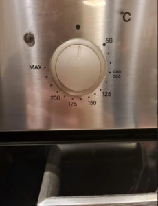
#40 My ovens terrible temperature dial with odd and inconsistent intervals between temperature, and who knows after 200 (reuploaded for not giving enough detail)
Source: InquisitorCorinthius
And there you have it—40 design disasters that left us scratching our heads and clutching our sides in laughter. From baffling bathroom layouts to signage that defies all logic, these creations prove that not all ideas should make it past the brainstorming phase… let alone into real life. Somewhere, a designer proudly hit “send,” a manager said “looks good to me,” and the world was never the same.
But hey, while these fails may not win any awards, they’ve certainly earned a special place in our hearts (and meme folders). If nothing else, they’re a comforting reminder that perfection is overrated and sometimes, a good laugh is the best kind of design.
Seen any terrible design choices out in the wild? Let them inspire you—or at least warn you what not to do. And remember: the next time you’re faced with a confusing sign or a staircase to nowhere, just smile and think, “Who greenlit this?” Then take a picture… because the internet deserves to see it too.

